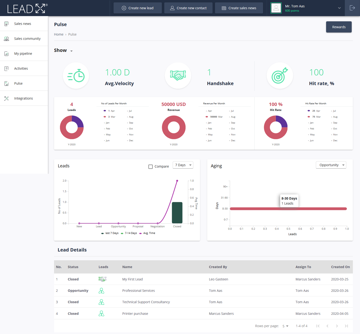
Pulse is an BI dashboard that gives a aggregated view of the organization’s current status. You can get detailed statistical information about current Leads, revenue, hit rate and handshakes.
The below screen shows how pulse dashboard is displayed
KPI | Description |
|---|---|
Avg. Velocity | The Average velocity is calculated based on the average time required for Leads from Lead stage to Closed Won stage |
Handshake | It calculates the total number of handshakes performed across the organization |
Hit Rate | It calculates the total number of leads won against total number of leads entered in to the platform |
No of Leads Per month | Pie chart displays total number of leads generated per month of current year |
Revenue Per Month | Pie chart displays total Revenue generated per month for the current year |
Hit Rate Per Month | Pie chart displays the hit rate per month for the current year |
Leads
Leads chart displays the total number of lead in various stages in last 7 days, 30 days, 90 days and 1 year.
Leads chart also displays the comparison between the time period selected by the user
e.g. if period is selected as 7 days then chart displays Leads in each stage for last 7 days and its comparison with Leads displayed in each stage between 7th to 14th day
The Chart also display Avg. Time line that explains how much was the average time gone for lead to move from one stage to another
Aging
Aging chart displays total number of leads in specific stage for 0-7 days, 8-30 days, 31-90 days and 90+
e.g. Total number of lead in specific period for Opportunity stage
Lead Details
The table displays list of all the leads created in the Application along with its details
If Multi-Organization feature is enabled then for Manager User of Parent Organization can view the performance of each organization by selecting the organization from the Organization drop-down provided at the top of the Dashboard